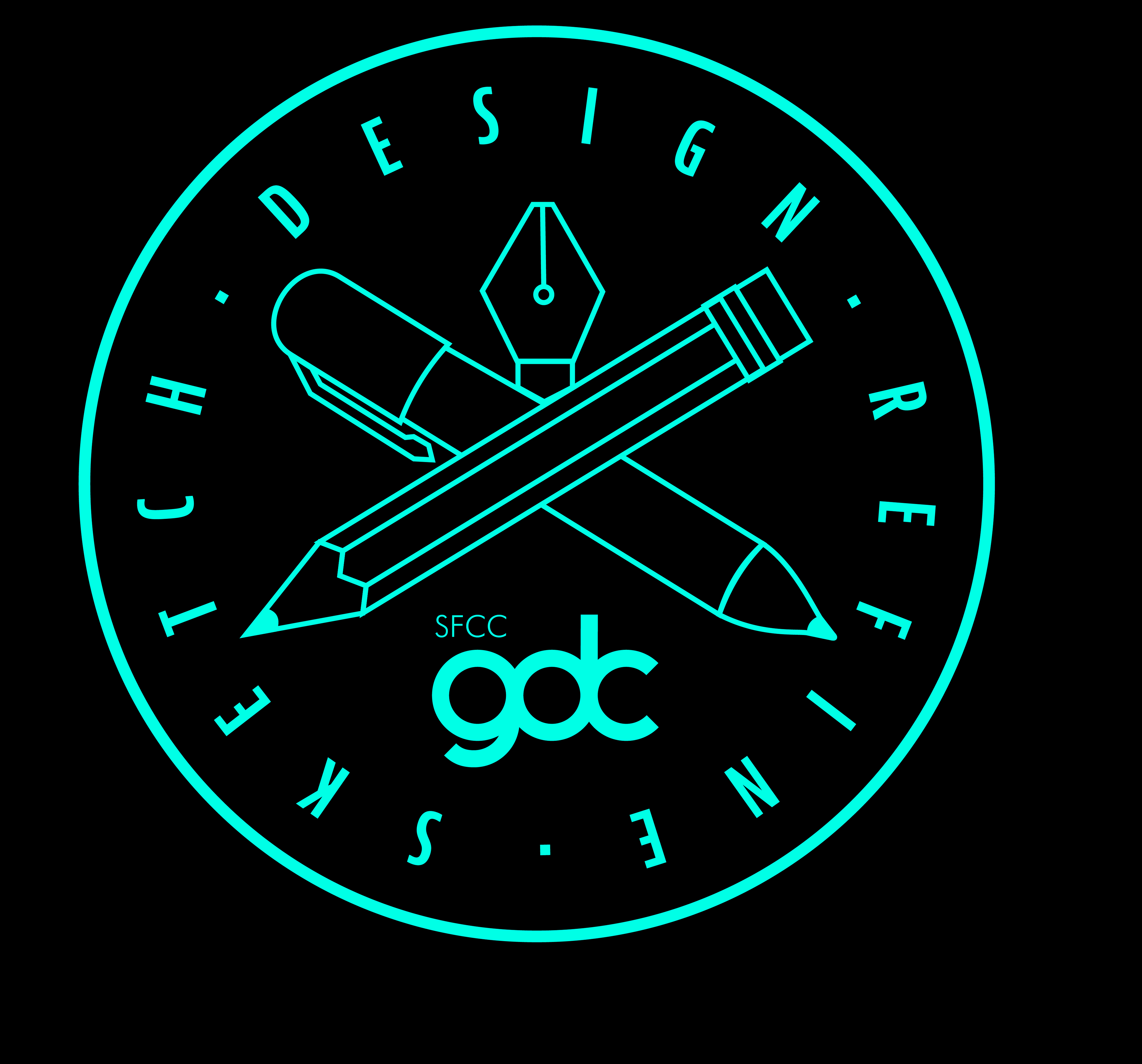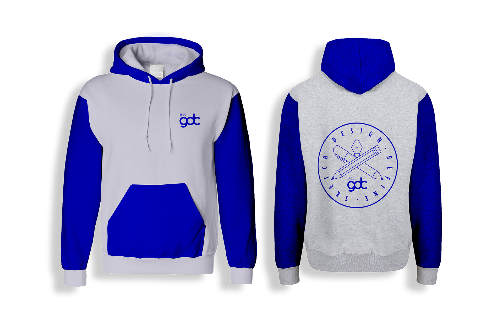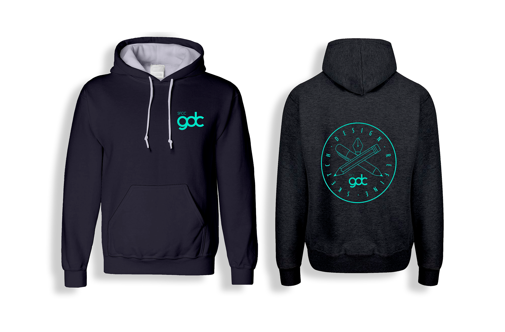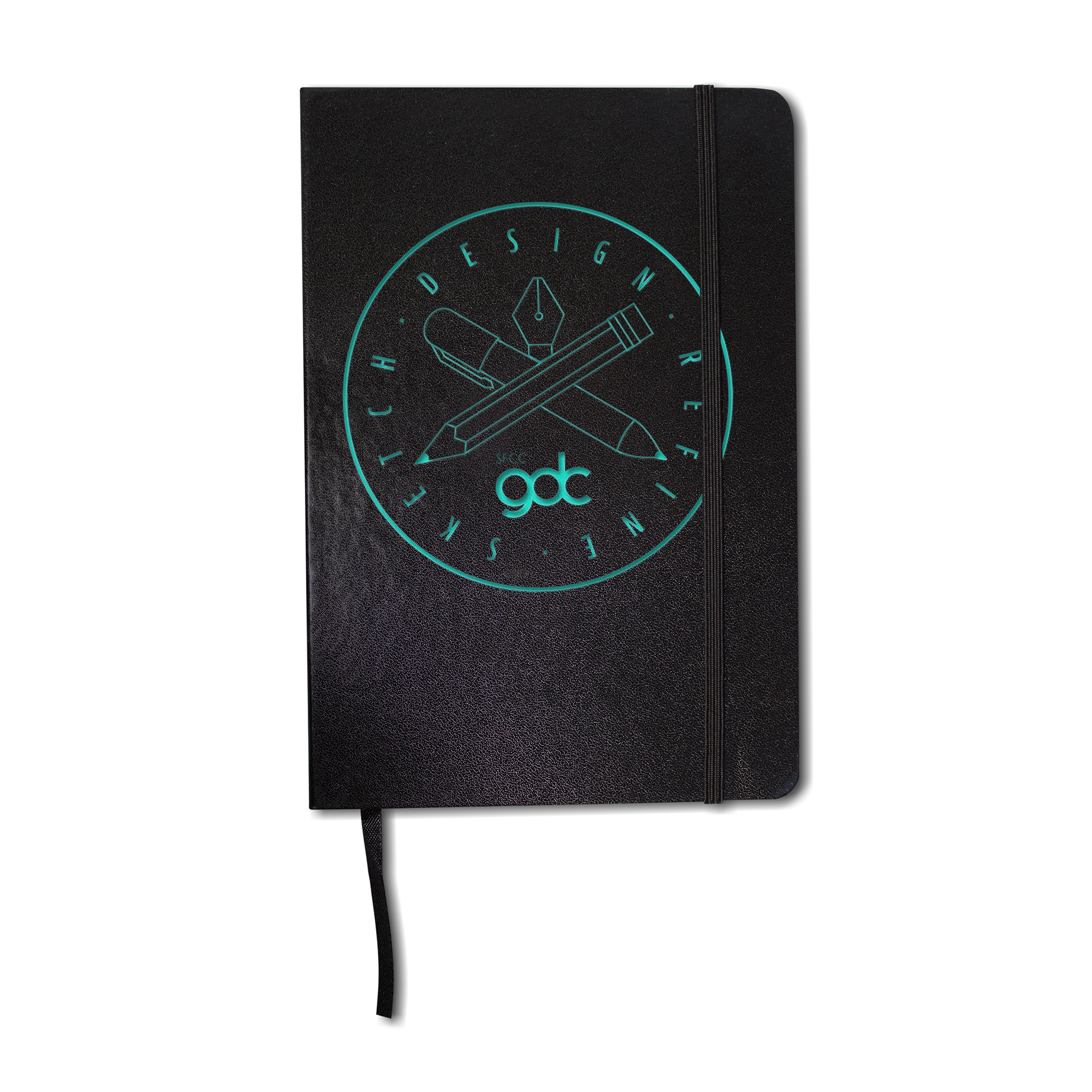
Sketch • Design • Refine
Speciality Promotion Design

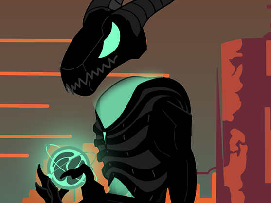
With the speciality promotion design the initial shape in which the text to the life of was to represent a door and show the even balance amongst the text.
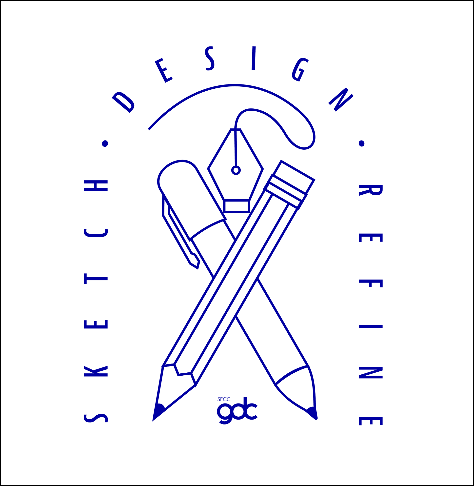
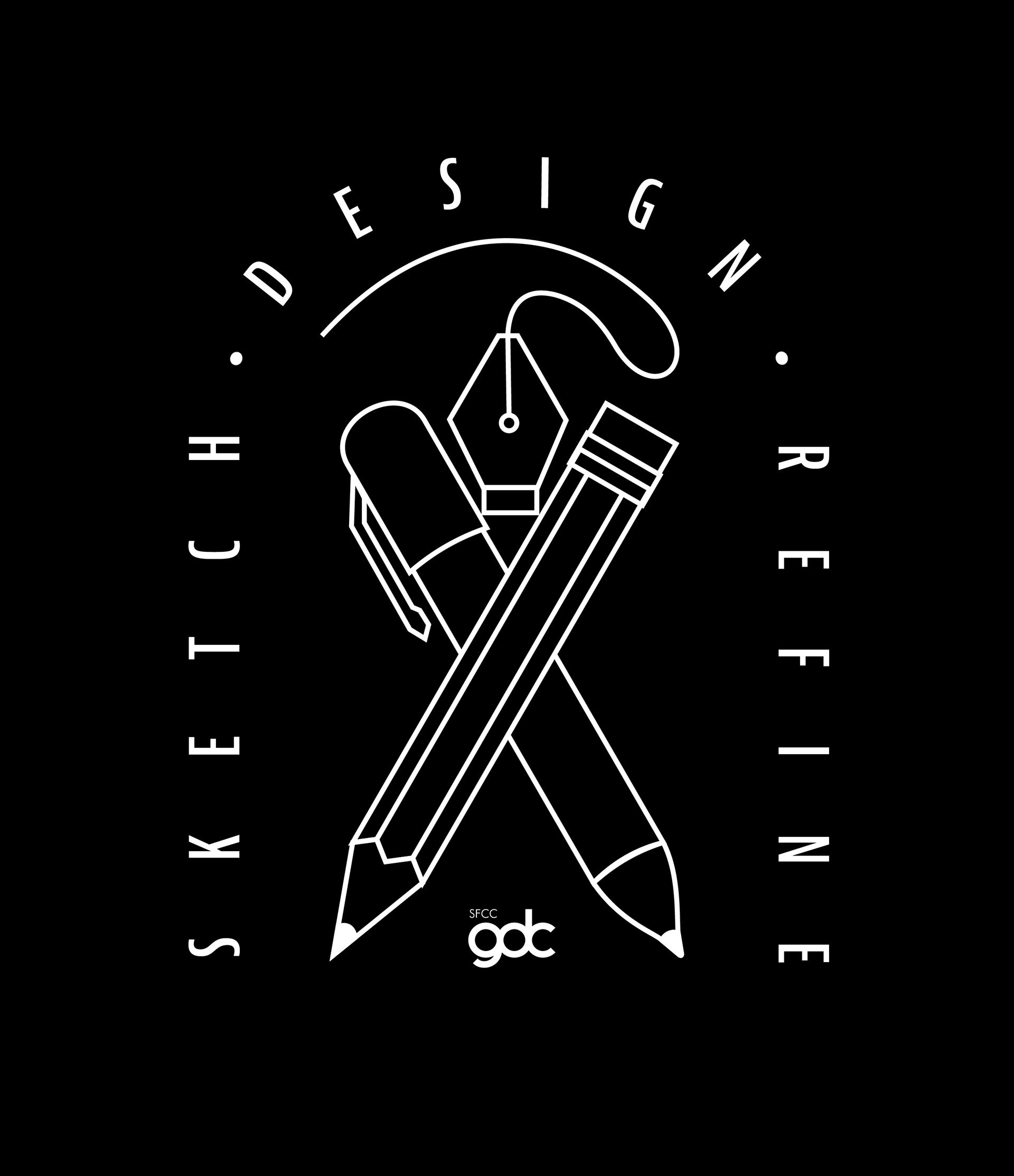

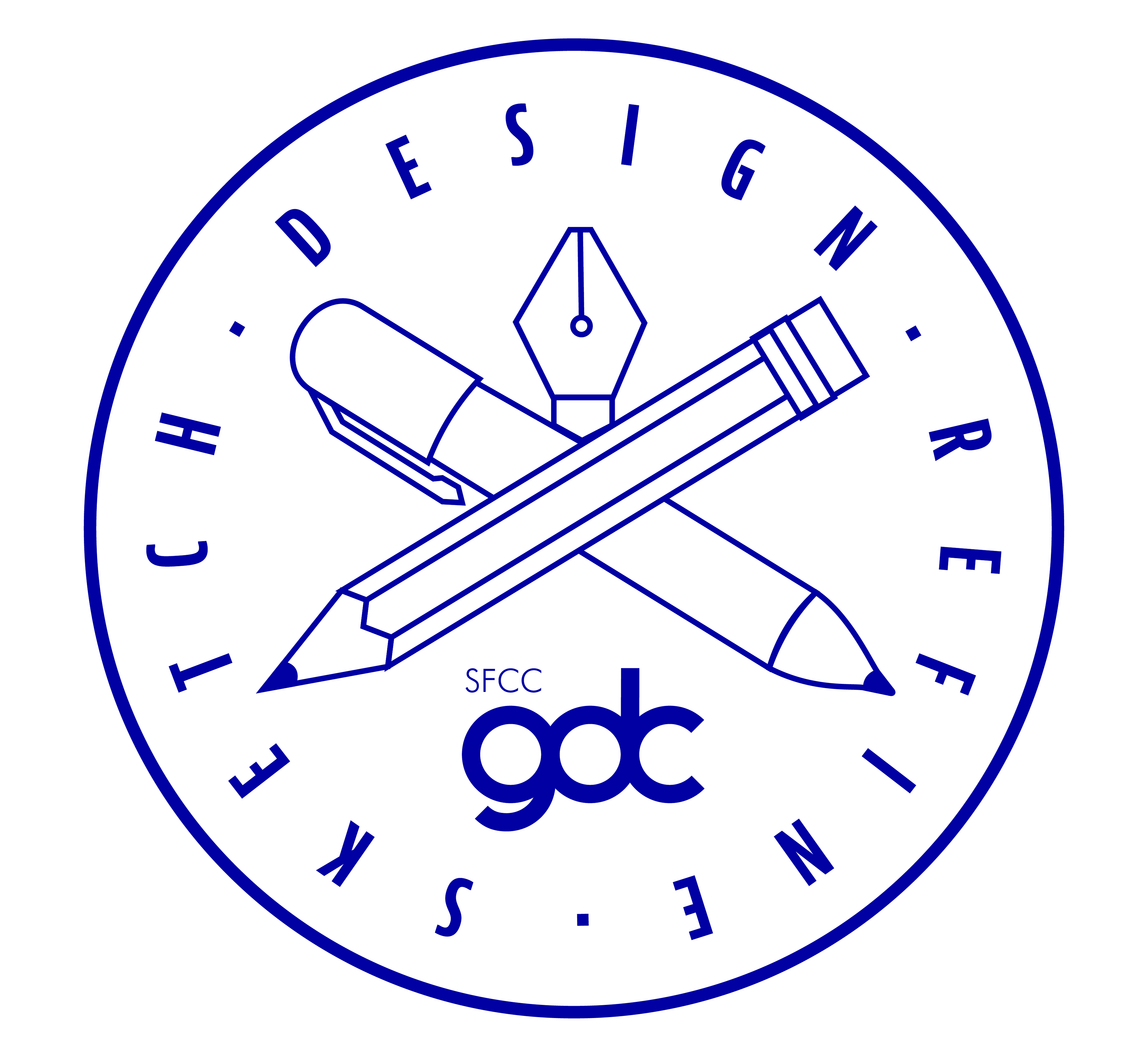
After taking a look back and reworking the design layout and shape it made more sense and was more practical to go the way of a circle.
To stay in theme of color and provide readability on darker backgrounds teal was chosen to bring life to the design.